Choosing a Cohesive Color Palette for Interior Design can be a daunting task, but it is essential for creating a harmonious and visually pleasing space. Whether revamping a single room or designing an entire home, selecting the right colors can significantly impact the overall ambiance and style. In this blog post, we will guide you through choosing a cohesive color palette for your interior design project. From understanding color theory to considering the mood and function of the space, we will provide you with practical tips and step-by-step guidance. By the end of this post, you will have the knowledge and confidence to create a color scheme that enhances your space and reflects your style. So, let’s dive in and discover the art of choosing a cohesive color palette for your interior design!
Here are some steps to help you pick a cohesive color palette for your interior design:
• Start with inspiration
Look for inspiration in magazines, websites, or nature. Find images that resonate with you and note the colors that catch your eye. This will give you a starting point for your color palette.
• Consider the mood
Consider the mood or atmosphere you want to create in the space. Do you want it to be calm and soothing, vibrant and energetic, or somewhere in between? Different colors evoke different emotions, so choose colors that align with the desired mood.
• Understand color theory
Familiarize yourself with the basics of color theory. Learn about the color wheel, color harmonies (such as complementary or analogous colors), and the effects of warm and cool colors. This knowledge will help you create a well-balanced palette.
• Choose a dominant color
Select one color that will serve as the dominant color in your palette. This color will be used in larger quantities and will set the overall tone of the space. Consider the existing elements in the room, such as furniture or artwork, and choose a color that complements them.
• Select secondary colors
Once you have your dominant color, choose one or two secondary colors to complement it. Secondary colors can be analogous (next to each other on the color wheel) or complementary (opposite on the color wheel). This will add depth and interest to your color palette.
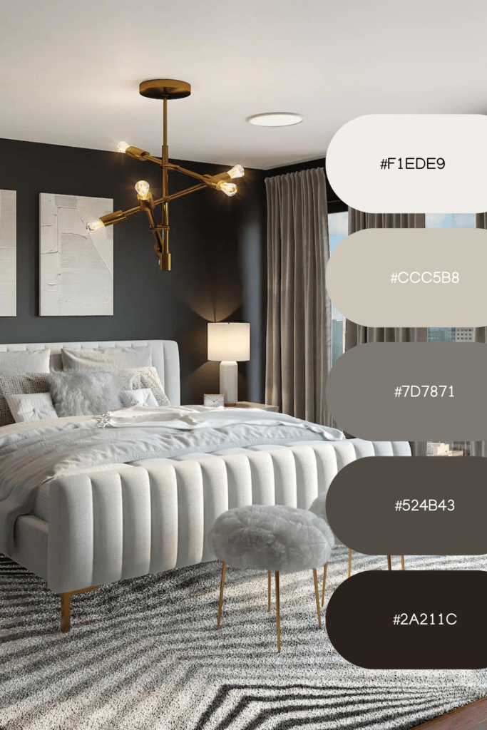
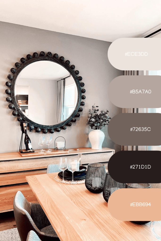
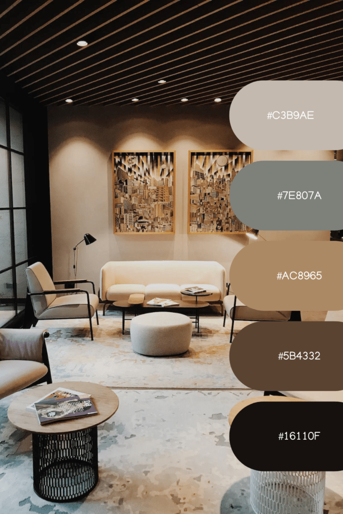
• Think about neutrals
Neutrals are essential in any color palette as they provide balance and allow other colors to shine. Consider incorporating neutral colors like whites, grays, or beiges for walls, flooring, or large furniture.
• Test the colors
Before committing to any color, test them in the space. Get paint samples, fabric swatches, or small accessories in your chosen colors and see how they look in different lighting conditions throughout the day. This will help you visualize how the colors will interact in your space.
• Consider the flow
Consider the flow between rooms: If you have an open floor plan or connected rooms, consider how the color palette will flow from one space to another. Maintaining a consistent color scheme throughout your home will create a cohesive and harmonious look.
• Don’t forget about textures
Texture plays a crucial role in interior design, so consider how different textures will interact with your color palette
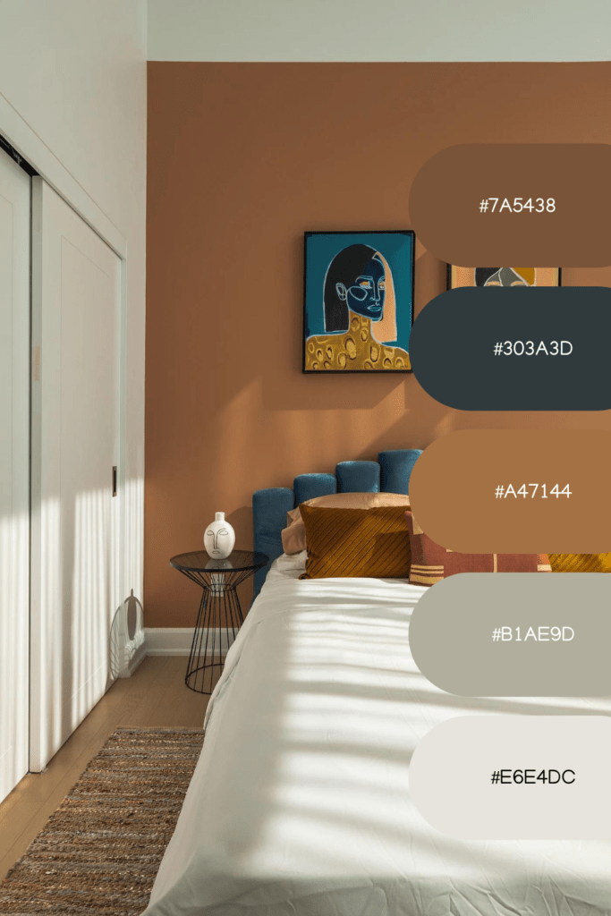
Selecting a Coordinated Color Palette for Interior Design: A Step-by-Step Guide.
Picking a coordinated color palette for interior design can significantly enhance the overall look and feel of your space. Here is a step-by-step guide to help you through the process:
• Determine your style
Before selecting colors, it’s essential to understand your design style. Are you aiming for a modern, minimalist, traditional, or eclectic look? Different styles often have specific color schemes, so identifying your style will help guide your color choices.
• Consider the purpose of the space
Think about the purpose of the room you’re designing. Is it a bedroom that should promote relaxation, a kitchen that needs to feel energizing, or a home office that requires focus? The function of the space will influence the color palette you choose.
• Start with a base color
Select one that will serve as the foundation for your palette. This color is typically neutral and used on larger surfaces such as walls or floors. Neutral colors like whites, grays, or beiges provide a versatile base that can work well with various accent colors.
• Explore color combinations
Once you have a base color, consider different combinations to complement it. You can use color charts or online tools to explore various color schemes such as monochromatic (shades of a single color), analogous (colors next to each other on the color wheel), or complementary (opposite colors on the color wheel). Experiment with combinations to find the ones that resonate with your style and desired mood.
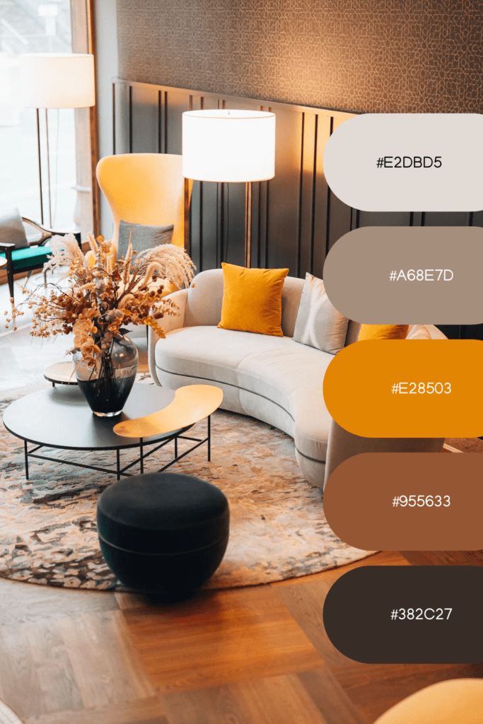
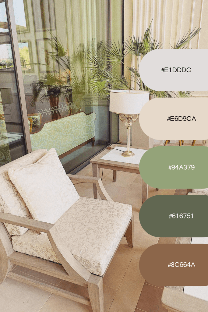
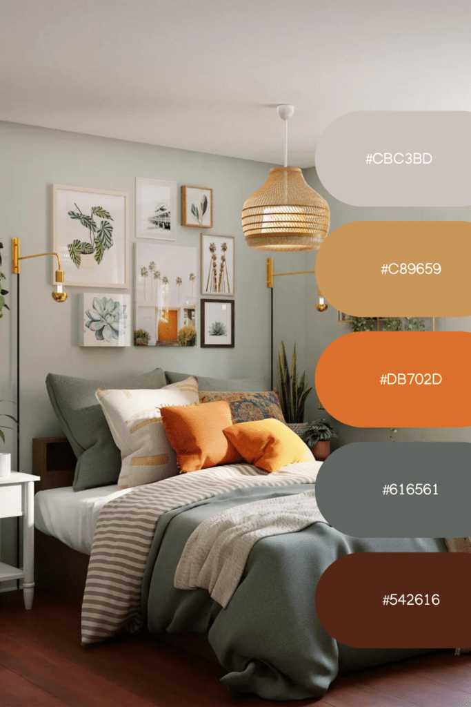
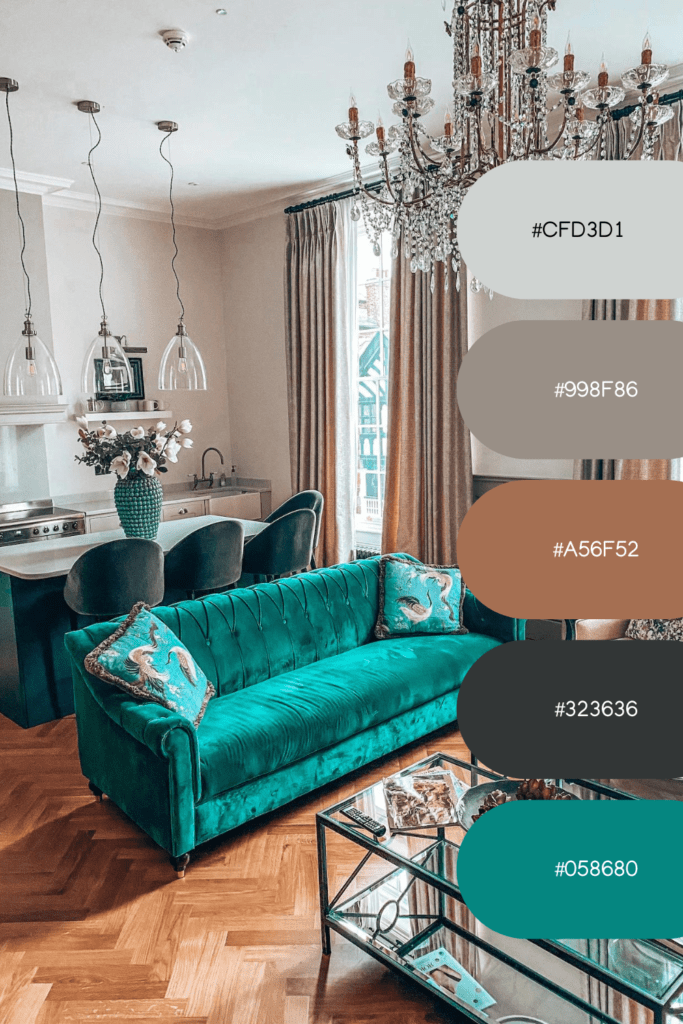
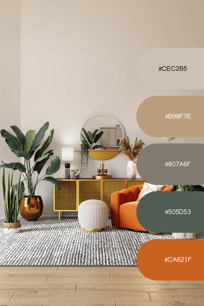
• Consider the 60-30-10 rule
A famous rule in interior design is the 60-30-10 rule. This guideline suggests allocating 60% of the room to the dominant color, 30% to the secondary color, and 10% to an accent color. This distribution helps create balance and harmony in your color palette.
The 60-30-10 rule in decorating, or the 60-30-10 guideline, is a principle used to create a balanced and visually appealing color scheme. It suggests allocating 60% of a room’s color to the dominant color, 30% to the secondary color, and 10% to an accent color.
The dominant color is the primary color in the room and is usually applied to walls, large furniture pieces, or flooring. It sets the overall tone and serves as a backdrop for other colors.
The secondary color complements the dominant color and is used for items like upholstery, curtains, or rugs. It adds depth and interest to the room.
The accent color is the boldest and most vibrant color in the scheme. It is used sparingly on accessories, artwork, or smaller decor items to create visual interest and focal points.
Following this rule helps maintain balance and harmony in the color palette while allowing for variation and visual interest.
• Pay attention to undertones
When choosing colors for your interior design, it’s important to consider the undertones of each color to ensure they complement each other.
For example, if you have a cool-toned color like blue as your dominant color, it’s best to select secondary and accent colors that also have cool undertones, such as greens or purples. This creates a cohesive and balanced look.
On the other hand, mixing warm and cool undertones can create a clash and result in an unbalanced and visually jarring space. For instance, pairing a warm-toned beige with a cool-toned gray might create an awkward contrast.
By paying attention to undertones, you can create a color palette where the colors seamlessly blend together, enhancing the overall aesthetic of your space. It’s recommended to compare colors side by side in different lighting conditions to ensure their undertones complement each other and achieve the desired cohesive effect.
…
So, as you embark on your interior design journey, remember that choosing a cohesive color palette is like painting a masterpiece on the canvas of your home. By understanding color theory, considering the mood and function of the space, and paying attention to undertones, you can create a visually stunning and harmonious environment that truly reflects your personal style.
So go ahead, let your creativity soar and unleash the transformative power of color. Whether you opt for a monochromatic scheme, a complementary palette, or a bold mix of contrasting colors, trust your instincts and have fun with it.
Remember, your home should be a reflection of your personality and a place that brings you joy. So, take the leap, experiment with colors, and create a space that not only looks amazing but feels amazing too.
Now, armed with the knowledge and tips from this blog post, go forth and design your dream space with confidence. Your cohesive color palette awaits!
Remember to leave your thoughts in the comments section below! What are your favorite color combinations for a cohesive interior design? Have you used the 60-30-10 rule in your own home? We would love to hear about your experiences and any additional tips you have for choosing a cohesive color palette.
If you found this blog post helpful, share it with your friends and family who might be embarking on their decorating journey. Let’s inspire and empower others to create beautiful and harmonious spaces together.
Thank you for joining us on this color-filled adventure! Happy decorating