Step into the fascinating world of color psychology, where the hues around us hold the power to shape our emotions, influence our behavior, and even alter our perception of reality. From the vibrant reds that ignite passion to the calming blues that soothe our souls, this blog post delves deep into the captivating realm of colors, unraveling the hidden meanings behind each shade and unlocking the secrets they hold within. Get ready to see the world through a whole new lens as we explore the impact of color on our minds, bodies, and beyond. Buckle up and prepare to be mesmerized by the enchanting world of color psychology!
What is Color Psychology?
Color psychology is the study of how colors affect human behavior and emotions. It explores how different colors can evoke specific feelings, thoughts, and reactions in individuals. This field of study suggests that colors can influence mood, perception, and decision-making.
Its findings are often used in marketing, branding, interior design, and other fields to create specific atmospheres or to communicate particular messages.
Color psychology also suggests that cultural and personal experiences can influence individual responses to colors. Different cultures may have various associations and meanings attached to specific colors. Additionally, personal experiences and preferences can also affect how an individual responds to colors.
The Meaning of Colors
Colors can have various meanings and associations depending on cultural, personal, and contextual factors. Here are some common meanings associated with different colors:
• Color Psychology of Red
Often associated with passion, love, energy, power, and excitement. It can also symbolize danger or anger in specific contexts.
– In China, red symbolizes luck, joy, and celebration. It is commonly used during festivals and weddings.
– In many Western cultures, red is associated with love, passion, and excitement. It is often used to represent romance and Valentine’s Day.
• Color psychology of Blue

Symbolizes calmness, tranquility, serenity, and stability. It can also represent trust, loyalty, and reliability.
– In many Western cultures, blue is associated with calmness, tranquility, and stability. It is often used in healthcare settings to create a sense of relaxation.
– In Hinduism, blue is associated with Krishna and represents divine love and protection.
• Color Psychology of Yellow
Associated with happiness, optimism, positivity, and energy. It can also symbolize caution or warning.
– In many Asian cultures, yellow symbolizes happiness, prosperity, and royalty. It is often used in traditional ceremonies and clothing.
– In Western cultures, yellow can symbolize joy, optimism, and sunshine. However, it can also be associated with caution or warning.
• Color Psychology of Green
Green is often associated with nature, growth, and harmony. It is commonly seen as a calming and refreshing color that promotes feelings of balance and tranquility. The color green is also linked to fertility, renewal, and vitality.
It is often used to represent health and environmental awareness. Additionally, green can be associated with wealth and prosperity. However, different shades of green can evoke different emotions and have varying psychological effects. For example, dark green may be associated with stability and wealth, while bright or neon green may be seen as energetic or youthful.
– In many Asian cultures, yellow symbolizes happiness, prosperity, and royalty. It is often used in traditional ceremonies and clothing.
– In Western cultures, yellow can symbolize joy, optimism, and sunshine. However, it can also be associated with caution or warning.
• Color Psychology of Orange
Often associated with enthusiasm, creativity, warmth, and vitality. It can also symbolize excitement or caution.
The cultural symbolism of the color orange can vary across different societies and traditions. Here are a few examples:
In many Western cultures, orange is often associated with energy, enthusiasm, and warmth. It can represent optimism, creativity, and joy. Orange is also commonly associated with harvest and autumn, as the color is reminiscent of pumpkins and changing leaves.
In Hinduism and Buddhism, orange is considered a sacred color and is associated with spirituality and enlightenment. Monks and holy figures often wear orange robes as a symbol of renunciation and devotion.
In the Netherlands, orange has strong cultural significance. It is the national color and is associated with the Dutch royal family, known as the House of Orange-Nassau. Orange is celebrated during national holidays and sporting events, such as King’s Day and football tournaments.
In some Buddhist cultures, orange represents the highest level of human enlightenment. It is associated with the saffron robes worn by Buddhist monks and nuns, symbolizing renunciation, purity, and spiritual awakening.
• Color Psychology of Purple
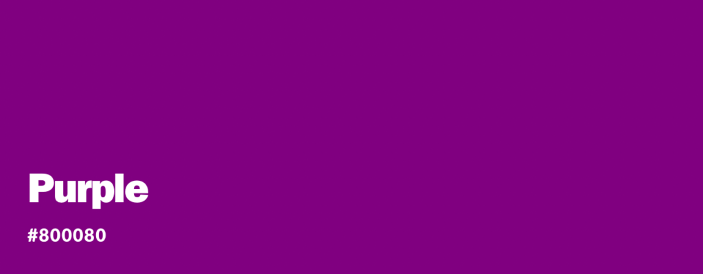
Symbolizes luxury, royalty, spirituality, and creativity. It can also represent mystery, elegance, or mourning in some cultures.
– In ancient Rome, purple was associated with royalty and power. It was considered a regal color and was worn by emperors.
– In many Western cultures, purple is associated with luxury, spirituality, and creativity. It is often used in branding or products targeting a sophisticated audience.
• Color Psychology of Pink
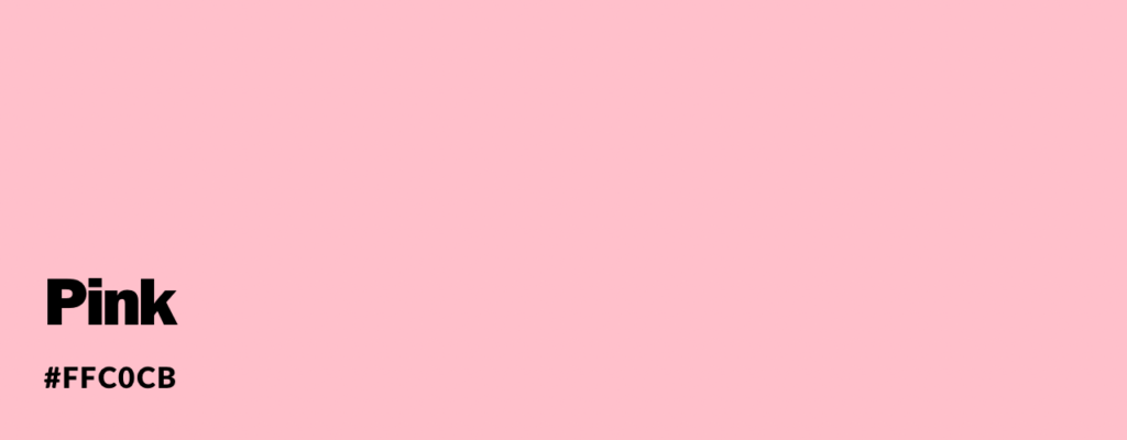
Often associated with femininity, tenderness, and romance. It can also symbolize sweetness, sensitivity, or playfulness.
In many Western cultures, pink is often associated with femininity, tenderness, and sweetness. It is commonly used in products and marketing targeted towards girls and women. Pink is often used to represent love, nurturing, and compassion. It can also be associated with innocence and youthfulness.
In Japan, pink is associated with cherry blossoms (sakura) and symbolizes spring, renewal, and beauty. The blooming of cherry blossoms is highly celebrated, and pink is used extensively during the cherry blossom season.
In some regions of India, pink is associated with celebration and joy. It is often used in traditional clothing, particularly during festivals and special occasions.
• Color Psychology of Black

Symbolizes power, elegance, formality, and mystery. It can also represent mourning or negativity in specific contexts.
In many Western cultures, black is associated with power, elegance, and formality. It is often worn during formal events or business settings.
– In some African cultures, black is associated with mourning and is worn during funeral ceremonies.
• Color Psychology of White

Often associated with purity, innocence, simplicity, and cleanliness. It can also symbolize peace, spirituality, or emptiness.
– In many Eastern cultures, white symbolizes purity, innocence, and spirituality. It is often used in wedding ceremonies and funerals.
– In Western cultures, white is associated with purity and cleanliness. It is often used in medical settings and weddings.
• Color Psychology of Gray

Symbolizes neutrality, practicality, and balance. It can also represent sadness, dullness, or conformity.
In many Western cultures, gray symbolizes neutrality, practicality, and modesty. It is often used to represent balance, calmness, and stability. Gray is also commonly associated with professionalism and is often used in business attire.
In some East Asian cultures, particularly in China, gray can be associated with mourning and sadness. It is often worn as a color of mourning during funerals and is seen as a symbol of respect for the deceased.
In some Native American cultures, gray can symbolize wisdom, knowledge, and the ability to adapt to different situations. It represents the balance between light and dark and is associated with the natural world and the wisdom gained from it.
Modern symbolism: In contemporary culture, gray is sometimes associated with ambiguity, uncertainty, and conformity. It can also be seen as a symbol of simplicity, minimalism, and sophistication.
It’s important to note that the meanings and cultural symbolism of colors can vary and evolve and may not be universally applicable. Different cultures and individuals may have different interpretations and associations with the color gray.
How does Color Influence human emotions?
Color plays a significant role in shaping human emotions by influencing mood, perception, and behavior. Here are some ways in which color can impact emotions:
• Mood enhancement
Certain colors can uplift mood and create positive emotions. Warm colors like yellow, orange, and red are often associated with happiness, energy, and excitement. These colors can stimulate the release of dopamine, a neurotransmitter associated with pleasure and reward, leading to a positive emotional response.
• Calming and relaxation
Cool colors like blue and green are often associated with calmness, relaxation, and tranquility. These colors can have a soothing effect on the mind and body, reducing stress and anxiety. This is why they are commonly used in healthcare settings and stress-relief environments.
• Attention and stimulation
Bright and vibrant colors, such as red, can grab attention and evoke a sense of urgency or excitement. These colors are often used in advertising and marketing to capture the viewer’s attention and stimulate action or impulse buying.
• Cultural influences
Different cultures may have different associations and meanings attached to colors, which can influence emotional responses. For example, in Western cultures, white is often associated with purity and innocence, while in some Eastern cultures, white is associated with mourning.
• Personal experiences and preferences
Personal experiences and preferences can also shape emotional responses to colors. Someone with a positive experience associated with a particular color may feel joy or comfort when exposed. Likewise, individual preferences for specific colors can influence emotional responses and overall well-being.
• Evolutionary responses
Some researchers suggest that humans have evolved to associate certain colors with specific emotions. For example, studies have shown that people associate warm colors like red and orange with danger or excitement. In contrast, cool colors like blue and green are associated with calmness and relaxation. These associations may have developed to help humans quickly assess and respond to their environment.
• Color Symbolism
Colors can also convey symbolic meanings that have been culturally or historically established. For example, black is often associated with mourning or formality, while white symbolizes purity or innocence. These symbolic meanings can influence emotional responses to colors.
• Color Temperature
Warm colors, such as red and orange, are often associated with high energy and can evoke warmth and excitement. On the other hand, cool colors, such as blue and green, evoke calmness and feelings of tranquility and relaxation.
It’s important to note that the impact of color on emotions can vary among individuals due to cultural, personal, and individual differences.
How do businesses strategically use colors in their branding?
Businesses strategically use colors in their branding to create a particular perception, evoke emotions, and differentiate themselves from competitors. Here are some ways they do it:
• Brand Identity
Colors are crucial in establishing a brand’s identity. Businesses select colors that align with their core values, vision, and target audience. For example, an eco-friendly brand might use shades of green to convey sustainability and nature.
• Differentiation
Colors can help businesses stand out from their competitors. Selecting a unique color scheme can make a brand more memorable and easily recognizable. For instance, the bright yellow used by McDonald’s separates it from other fast-food chains.
• Consistency
Consistent use of colors across various brand touch-points, such as the logo, website, packaging, and marketing materials, helps create a cohesive and recognizable brand image. This consistency builds trust and familiarity with consumers.
• Accessibility
Brands must consider color accessibility for individuals with visual impairments. Ensuring a good contrast between text and background colors can improve readability for everyone.
• Trend and Industry Relevance
Colors can be influenced by trends and industry standards. Businesses may follow or challenge these norms to position themselves within the industry. For example, technology companies often use sleek and modern colors like silver or metallic tones.
Overall, businesses strategically use colors in their branding to create a visual identity that resonates with their target audience, communicates their values, and sets them apart from competitors.
What are some ways that businesses strategically incorporate colors into their branding?
Businesses strategically incorporate colors into their branding in various ways. Here are some common strategies:
• Logo Design
The logo is typically the most prominent visual element of a brand. Businesses carefully select colors that align with their brand identity and evoke the desired emotions. For example, vibrant and energetic colors like red or orange might be used by companies in the entertainment industry. At the same time, healthcare brands often choose calm and soothing colors like blue or green.
•Website and Digital Design
Colors play a crucial role in web design as they can influence user experience and perception. Businesses use colors strategically to guide users, highlight essential elements, and create a visually appealing interface. They consider factors like color contrast, readability, and visual hierarchy.
• Packaging and Product Design
Colors on product packaging can attract attention, communicate the brand’s personality, and differentiate it from competitors. For instance, luxury brands often use elegant and sophisticated colors like black or gold to convey a premium image, while playful and vibrant colors may be used for children’s products.
• Marketing and Advertising
Colors are utilized in marketing and advertising campaigns to capture audience attention and convey key messages. Businesses select colors that align with the campaign’s objective and target audience. For example, a company promoting a sale might use bold and eye-catching colors like red or yellow to create a sense of urgency.
• Physical Spaces
Brick-and-mortar businesses carefully consider color schemes for their physical spaces, such as retail stores, offices, or restaurants. Colors are chosen to create a specific atmosphere, influence customer behavior, and enhance the overall brand experience. For instance, restaurants often use warm colors like red or orange to stimulate appetite and create a cozy ambiance.
• Brand Guidelines
To maintain consistency, businesses develop guidelines outlining the approved color palette, usage rules, and combinations. These guidelines ensure that colors are used consistently across all brand assets, from digital platforms to printed materials.
• Social Media and Visual Content
In the age of social media, businesses use colors strategically to capture attention in the sea of content. Vibrant and visually appealing colors can make a brand’s content stand out and increase engagement. Consistency in color usage across social media platforms also helps strengthen brand recognition.
List of basic color theory terms you should know about
Color terminology refers to the specific words and phrases used to describe colors. It encompasses various terms that help identify and communicate different hues, shades, and tones. Here are some commonly used color terminology:
• Hue
Hue refers to the attribute of a color that distinguishes it from others on the color wheel. It is one of the three primary dimensions of color perception, alongside saturation (chroma) and lightness/value. Hue is what we commonly refer to as the “color” itself, such as red, blue, green, or yellow.
• Chroma
refers to the purity or intensity of a color. It is one of the three dimensions of color perception, along with hue and lightness/value. Chroma measures the amount of grayness present in a color. A color with high chroma is vibrant, pure, and vivid, while a color with low chroma is duller and closer to gray.
• Shade
Shade refers to a variation of a color that is achieved by adding black to it. It is one of the ways to alter the value or darkness of a color. When black is added to a color, it creates a darker shade of that color.
For example, adding black to the color red creates different shades of maroon or burgundy. Similarly, adding black to blue results in various shades of navy or midnight blue.
Shades can also be achieved by mixing complementary colors, which are colors opposite to each other on the color wheel. Adding a small amount of a complementary color can darken the original color and create shades.
• Tint
Tint refers to a variation of a color that is achieved by adding white to it. It is one of the ways to alter the value or lightness of a color. When white is added to a color, it creates a lighter tint of that color.
For example, adding white to the color blue creates different tints of light blue or baby blue. Similarly, adding white to yellow results in various tints of pastel yellow or cream.
Tints can also be achieved by mixing a color with a lighter or paler version of itself. This can be done by diluting the original color with water or by using a lighter pigment.
• Tone
Tone refers to a variation of a color that is achieved by adding both gray and white to it. It is a way to alter the value or lightness of a color while also desaturating it. When gray and white are added to a color, it creates a muted or toned-down version of that color.
Tones can be seen as a middle ground between shades (darker versions) and tints (lighter versions) of a color. By adding gray to a color, it reduces the intensity or saturation of the color while also adjusting its value.
For example, adding gray and white to the color green can create different tones such as olive or sage. Similarly, adding gray and white to orange can result in tones like peach or terracotta.
• Saturation
Saturation refers to the intensity or purity of a color. It is one of the three primary dimensions of color perception, alongside hue and lightness/value. Saturation measures the amount of grayness present in a color.
A color with high saturation is vibrant, vivid, and pure, with minimal gray added. On the other hand, a color with low saturation appears more muted, washed out, or desaturated, with a higher amount of gray added.
Saturation can be adjusted by altering the amount of gray present in a color. Increasing saturation makes the color more intense and vibran while decreasing saturation makes it more subdued and muted.
• RGB
(Red, Green, Blue): This additive color model is used in digital displays and electronic devices. It classifies colors based on the intensity of red, green, and blue light.
• CMYK
(Cyan, Magenta, Yellow, Black): This is a subtractive color model primarily used in printing. It classifies colors based on the amount of cyan, magenta, yellow, and black ink required to achieve a specific hue.
• HSL/HSV
(Hue, Saturation, Lightness/Value): This color model defines colors based on their hue (the position on the color wheel), saturation (the purity or intensity of the color), and lightness/value (the brightness or darkness of the color).
• Pantone Matching System (PMS)
This is a proprietary color classification system commonly used in printing and design. It assigns unique identification numbers to each color, ensuring consistent color reproduction across different mediums.
• Natural Color Systems (NCS)
This color classification system describes colors based on how humans perceive them. It defines colors using attributes like hue, blackness, chromatics, and whiteness.
Through our journey, we have gained insights into how colors influence our mood, memory, and decision-making. We have witnessed how businesses strategically use colors in their branding to evoke specific emotions and create memorable consumer experiences. We have also learned how colors can transform our living spaces, creating harmonious environments that reflect our personality and enhance our well-being.
So, the next time you see a splash of color, take a moment to appreciate its significance. Reflect on how it makes you feel and shapes your perception of the world. Embrace the power of colors and use them to express yourself, connect with others, and create a life filled with beauty and harmony.
Now armed with the knowledge of color psychology, explore colors’ endless possibilities. Let them ignite your creativity, influence your mood, and transform your surroundings. Embrace the magic of colors and let them add a splash of brilliance to your life.
What are your thoughts on color psychology? Have you ever noticed the impact that colors have on your mood or behavior? How do you personally use colors to enhance your surroundings or express yourself? Share your insights and experiences in the comments below!