A Beginners Guide to Understanding the Fundamentals of Colors
Color theory is a framework that explains how colors relate to and interact with each other. Its an essential aspect of art, design, and visual communication. By understanding the basics of Color Theory, you can make informed decisions when working with colors. Here’s a beginner’s guide to help you grasp the fundamentals.
Colors are integral to our visual world, influencing our perceptions, emotions, and decisions. Whether you are an artist, designer, or simply someone who appreciates the beauty of colors, understanding the Color wheel is essential for harnessing the full potential of this vibrant spectrum. Here’s a beginner’s guide to help you grasp the fundamentals.
What is a Color Wheel?
The Color Wheel is a visual representation of the relationships between colors. It acts as a guide, helping us understand how colors interact and harmonize. It is used in various fields, including art, design, and fashion, to understand and select color combinations. By exploring the color wheel, we can unlock a wealth of knowledge about color theory, mixing, and creating visually captivating compositions.
Now that you know what a color wheel is, we will delve into its intricacies. We will start by understanding the primary colors—the foundation upon which all other colors are built.

1. Primary Colors
The primary colors are the foundation of the color wheel. They are pure colors that cannot be created by mixing other colors. The primary colors are red, blue, and yellow.
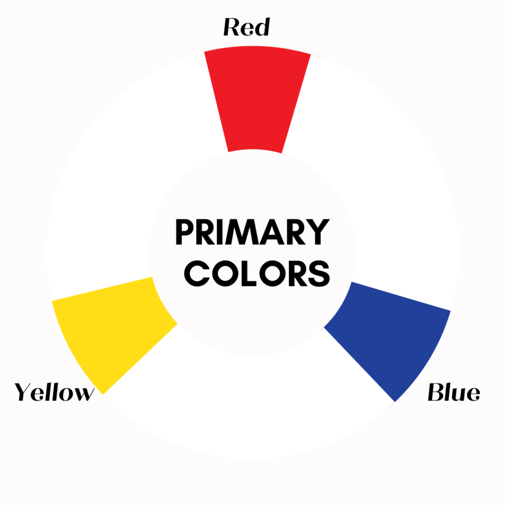
Primary colors play a significant role in color theory, forming the foundation for understanding how colors interact and combine to create various hues, shades, and tones. Here are a few critical points on the significance of primary colors in Color Theory:
Here’s a deeper look into the value of primary colors:
• Building Blocks
Primary colors are considered the building blocks of all other colors. They cannot be created by mixing other colors but serve as the base from which all other colors are derived. The three primary colors are red, blue, and yellow. These colors are positioned at equal intervals on the color wheel, forming a triangle.
• Color Mixing
Primary colors are used to create secondary and tertiary colors through color mixing. Combining different amounts of primary colors can achieve a wide range of hues and shades. For example, mixing red and yellow creates orange, while combining blue and yellow produces green. This ability to mix primary colors is fundamental to artists, designers, and anyone working with color.
• Color Subtraction
Primary colors are also crucial in color subtraction. In subtractive color mixing, primary colors are used to remove or subtract specific wavelengths of light, resulting in the perception of a particular color. For example, when red, blue, and green pigments are mixed, they subtract or absorb all other colors, resulting in the perception of black. This principle is used in various fields, including painting, printing, and color reproduction.
• Color Psychology
Primary colors have strong psychological associations and evoke different emotions and moods. Red is often associated with energy, passion, and intensity. Blue is linked to calmness, serenity, and reliability. Yellow is associated with happiness, optimism, and warmth. These associations can influence how primary colors are used in art, design, marketing, and branding to elicit specific emotional responses from viewers or consumers.
• Color Contrast
Primary colors create strong contrast when used together or about each other. Their distinct hues and positions on the color wheel make them visually striking when placed side by side. This contrast can create emphasis, focal points, or visual interest in artwork or design compositions. Combinations like red and blue or yellow and blue often make vibrant and attention-grabbing color schemes.
Overall, primary colors are fundamental in color theory, serving as the building blocks for understanding color relationships, creating harmonious color palettes, and expressing artistic vision. By grasping the significance of primary colors, one can navigate the complexities of color theory and unlock the creative potential of colors.
2. Secondary Colors
Secondary colors are created by mixing equal parts of two primary colors. The secondary colors are orange (red + yellow), green (blue + yellow), and purple (red + blue). They are located between the primary colors on the color wheel.
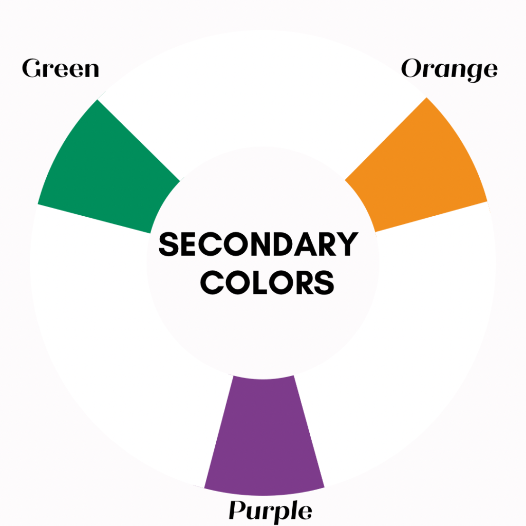
Secondary colors play a crucial role in the color wheel and theory as they are created by mixing two primary colors. Here’s a closer look at the significance of secondary colors:
• Color Wheel Expansion
Secondary colors expand the color wheel beyond the primary colors, allowing for a broader range of hues. Secondary colors are created by mixing equal parts of two primary colors. The three secondary colors are orange (red + yellow), green (yellow + blue), and purple (blue + red). These colors form a triangle between the primary colors on the color wheel.
• Color Harmony
Secondary colors are often used in color harmonies and schemes. They provide a balanced and visually appealing contrast to primary colors. For example, complementary color schemes pair a primary color with its corresponding secondary color. This creates a vibrant and visually striking combination that can draw attention or create a focal point in artwork or design.
• Color Mixing
Secondary colors can also be mixed with primary and secondary colors to create various color variations. For instance, mixing orange and yellow can result in multiple shades of yellow-orange, while mixing green and blue can produce different shades of blue-green. This allows artists and designers to achieve nuanced color palettes and explore the subtleties of color mixing.
• Symbolism and Associations:
Secondary colors can separate their symbolism and associations from primary colors. For example, orange is often associated with energy, enthusiasm, and creativity. Green is associated with nature, growth, and tranquility. Purple is often linked to luxury, royalty, and mystery. Understanding these associations can help artists and designers convey specific emotions or messages through secondary colors.
• Color Balance
Secondary colors are crucial in achieving color balance in artwork and design. They can create harmony and cohesion by balancing out the dominance of primary colors. Including secondary colors in a composition can help develop a sense of unity and visual balance, ensuring that no one color overwhelms the overall color scheme.
Secondary colors expand the color wheel, contribute to color harmonies, provide opportunities for color mixing, have their symbolism and associations, and help achieve color balance in artwork and design. Understanding the significance of secondary colors allows artists and designers to create visually engaging compositions and effectively communicate through the language of color.
We will delve into tertiary colors, which offer even more possibilities for artistic expression.
3. Tertiary Colors
Tertiary colors are formed by mixing a primary color with a neighboring secondary color. These colors provide a more comprehensive range of hues and are situated between the primary and secondary colors on the wheel. Examples of tertiary colors include red-orange, yellow-green, and blue-purple.
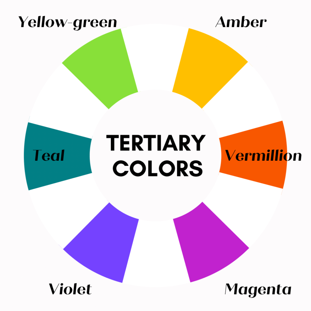
Tertiary colors play a significant role in the color wheel and color theory. Here’s a closer look at their significance:
• Definition
Tertiary colors are created by mixing equal amounts of a primary color with an adjacent secondary color on the color wheel. There are six tertiary colors: red-orange, yellow-orange, yellow-green, blue-green, blue-violet, and red-violet. These colors bridge the gap between primary and secondary colors, offering a wide range of hues and shades.
• Color Variety
Tertiary colors provide shades, tones, and subtle variations that add depth and complexity to artwork, design, and visual compositions. They offer more nuanced and sophisticated options than primary and secondary colors, allowing for greater creativity and expression.
• Color Harmony
Tertiary colors contribute to achieving color harmony and balance in designs. They can create complementary color schemes, where a primary color is paired with its complementary tertiary color. For example, red-violet can be paired with yellow-green. This combination creates visual interest and harmony, as the colors are opposite on the color wheel.
• Color Mixing
Tertiary colors can also be used in the mixing process to create even more colors. By combining primary, secondary, and tertiary colors, artists and designers can achieve an extensive palette of colors. This versatility allows for a broader range of expression and will enable artists to fine-tune and customize colors to their liking.
• Color Psychology
Like primary and secondary colors, tertiary colors have psychological associations and can evoke specific emotions and moods. For instance, red-violet may be associated with luxury and royalty, while yellow-green can be linked to freshness and vitality. Understanding the psychological impact of tertiary colors can help artists and designers create specific atmospheres or convey desired messages through their use of color.
• Color Context
Tertiary colors can be used strategically to enhance specific colors or create visual effects. Placing a tertiary color next to a primary or secondary color can make the latter appear more vibrant or intense. This technique is known as simultaneous contrast and can create visual impact and depth in artwork or design compositions.
Tertiary colors expand the color palette, contribute to color harmony, and offer a wide range of shades and tones. They can be mixed with primary and secondary colors to generate even more colors and provide opportunities for creative expression. Understanding the significance of tertiary colors allows artists and designers to create visually appealing and psychologically impactful compositions.
How can the color wheel help you choose the right color combination?
The color wheel is useful for choosing color combinations because it visually represents the relationships between different colors. Here’s how it can help:
1. Complementary Colors
Complementary colors are pairs of colors directly opposite each other on the color wheel. These pairs typically consist of one warm color and one excellent color. For example, blue and orange or red and green are complementary pairs. Using complementary colors in a design can create a dynamic and vibrant composition.
.
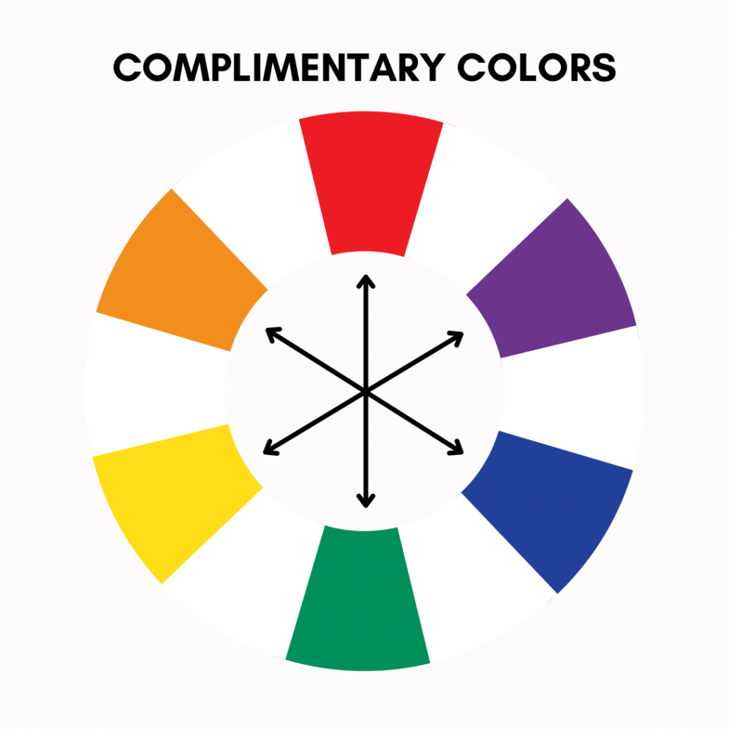
When placed side by side, complementary colors intensify each other, creating a vibrant and dynamic visual effect. You can strategically use this contrast to draw attention, make focal points, or add depth and dimension to a design.
Complementary colors also have the unique ability to neutralize or balance each other out when mixed. When you mix complementary colors in equal parts, they create shades of gray or brown, depending on the colors’ intensity. This quality makes them useful in color grading, shading, and toning down the intensity of a color scheme.
In addition to their visual impact, complementary colors can evoke certain emotions and moods. For example: The combination of blue and orange often associates with energy and vitality, while red and green create a sense of balance and harmony.
Combining complementary colors can help designers create visually striking and balanced compositions. They provide a powerful tool for creating contrast, establishing a focal point, and evoking specific emotional responses. So, the next time you work with colors, consider incorporating complementary pairs to make your designs pop and captivate viewers.
2. Analogous Colors
Analogous colors, as found on the color wheel, are groups of colors adjacent to each other. They share a similar hue and harmonious relationship, making them visually pleasing in design. For example, shades of blue, green, and yellow can create a calming and cohesive color palette, while warm shades of red, orange, and yellow can create a vibrant and energetic atmosphere.
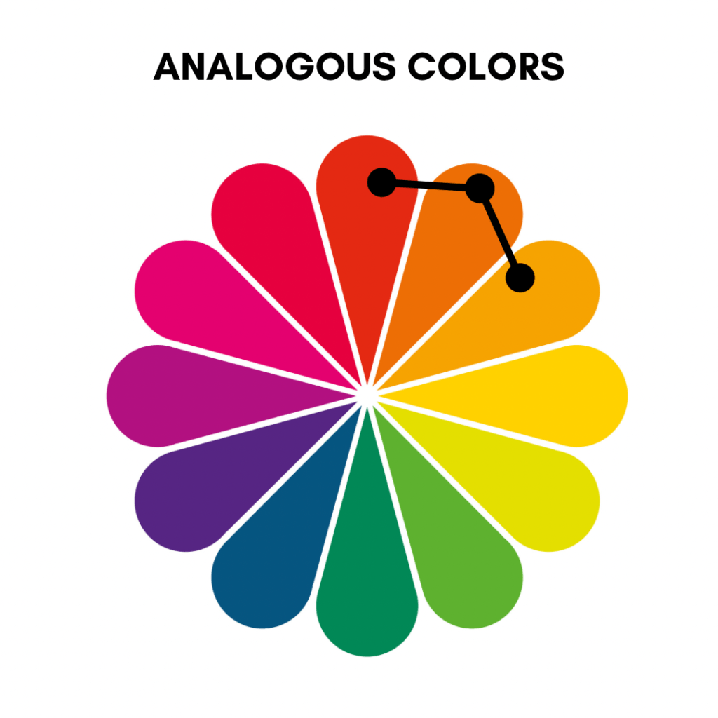
The significance of analogous colors lies in their unity and cohesion in a composition. When applied in a design, similar color schemes create a natural flow and a sense of harmony, as they are derived from the same color family. This makes them particularly useful for creating a soothing and balanced visual experience.
Additionally, analogous colors allow for subtle variations in shades and tints within a single color family, providing depth and visual interest to a composition. You can achieve this composition by incorporating lighter or darker tones of the chosen colors, adding complexity and dimension to the design.
When working with analogous colors, it’s important to consider the desired level of contrast and variety. Adding a complementary or neutral color as an accent can help create visual interest and prevent the design from becoming monotonous.
In summary, analogous colors offer a harmonious and cohesive color scheme that can evoke specific moods and create a pleasing visual experience. By understanding the significance of similar colors and how they interact on the color wheel, designers can effectively utilize them to create visually appealing and balanced compositions.
3. Triadic Colors
As the name suggests, Triadic colors are sets of three evenly spaced around the color wheel. These colors form an equilateral triangle when connected on the color wheel. Triadic color schemes offer a high contrast level while maintaining balance and harmony. Examples of triadic color schemes include using red, yellow, and blue or orange, green, and purple.
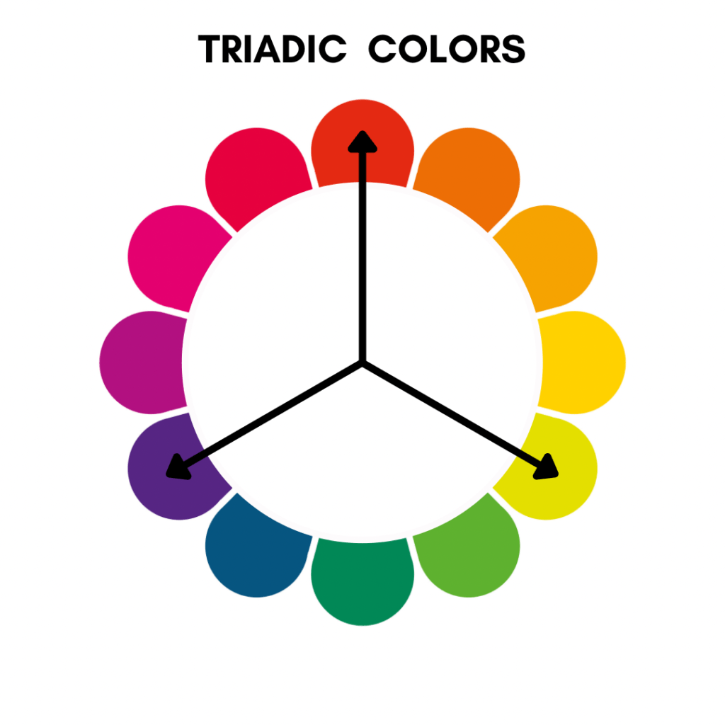
The significance of triadic colors lies in their ability to create vibrant and dynamic compositions. Using three colors equidistant from each other on the color wheel ensures that each color has equal visual weight, resulting in a well-balanced design. This balance is beneficial when designers want to create a bold, eye-catching visual impact.
Triadic color schemes also provide a wide range of color options, allowing for versatility in design. By selecting three colors from different segments of the color wheel, designers can achieve a rich and diverse palette. This variety can create depth, hierarchy, and visual interest within a composition.
One of the main advantages of triadic color schemes is their natural ability to create contrast. The distance between the colors on the color wheel ensures that each color stands out when placed side by side. You can strategically use this contrast to highlight specific elements, create focal points, or add energy and excitement to a design.
When working with triadic colors, it’s essential to consider the balance and proportion of each color within the composition. Adjusting the colors’ intensity, value, and saturation can help achieve a more harmonious and visually pleasing result.
Triadic color schemes offer a well-balanced and visually striking approach to color design. They provide contrast, variety, and balance, making them ideal for creating vibrant and dynamic compositions. By understanding the significance of triadic colors and their relationship to the color wheel, designers can effectively utilize them to create visually compelling designs.
4. Split-Complementary Colors
Split-complementary color schemes involve choosing a base color and then using the two colors adjacent to its complementary color. This creates a more nuanced variation of the complementary scheme. For instance, if the base color is blue, the split-complementary scheme may include orange and yellow-orange. This combination offers a visually attractive and balanced composition.
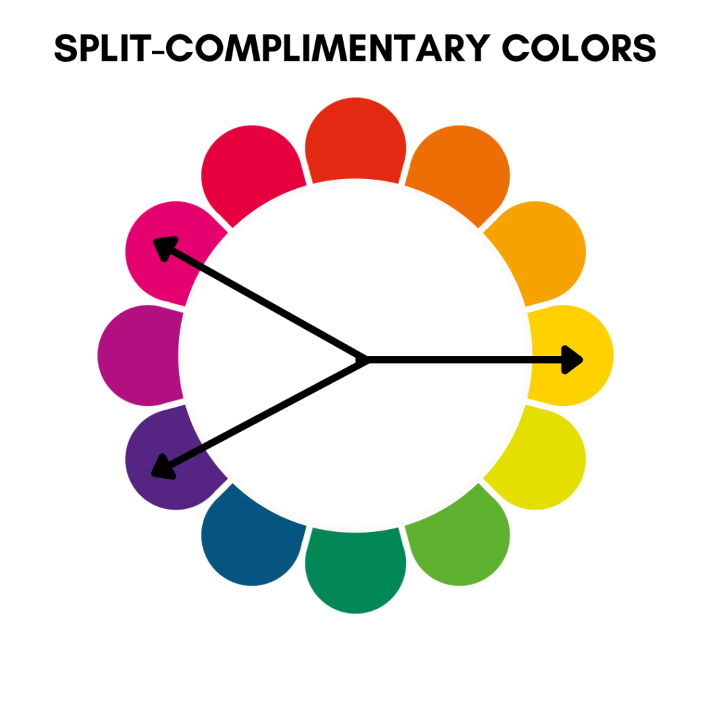
The significance of split-complementary colors lies in their ability to create visually exciting and harmonious compositions. Here are a few reasons why split-complementary colors are valuable:
• Balance
Split-complementary colors provide a balanced color combination by incorporating two colors adjacent to the direct complement. This helps avoid the solid visual contrast that can sometimes occur in complementary color schemes. The adjacent colors create a more subtle and harmonious balance between warm and cool tones.
• Variation
You introduce variation and depth into your color palette using split-complementary colors. Combining a base color with two adjacent colors allows for a broader range of hues and tones. This variation adds visual interest and complexity to your design without overwhelming the viewer.
• Increased Options
Split-complementary colors expand your color options while still maintaining a sense of cohesion. Instead of relying solely on the direct complement of a color, you have two additional colors to work with. This gives you more flexibility in choosing colors that work best for your design while achieving a harmonious balance.
• Visual Interest
Split-complementary colors offer a visually interesting combination that can make your design stand out. The adjacent colors add complexity and depth to your composition, making it visually engaging and dynamic.
When using split-complementary colors, it’s essential to consider their relationships and balance. The base color should be dominant, with the two adjacent colors used as accents or supporting elements. This way, you can create a cohesive and visually pleasing design that benefits from the unique qualities of split-complementary color schemes.
5. Monochromatic Colors
Monochromatic colors, as the name suggests, are derived from a single hue on the color wheel. They are created using different shades, tints, and tones of a single color. The significance of monochromatic colors in the color wheel lies in their ability to create a harmonious and cohesive color scheme with a sense of unity.
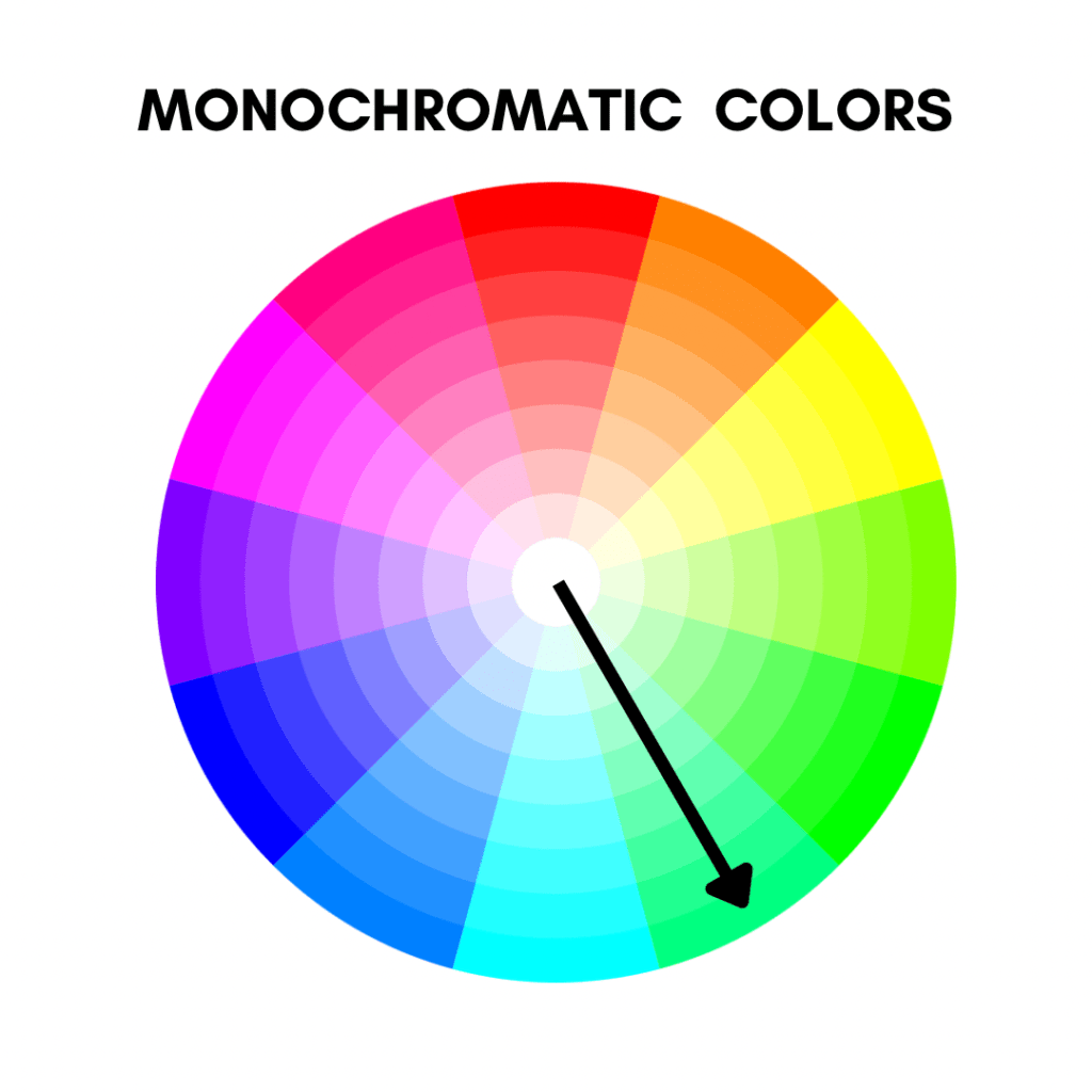
Here are some key points to understand their significance:
• Cohesion and Simplicity
Monochromatic color schemes provide a sense of cohesion and simplicity. By using different variations of a single color, you create a unified look that is visually pleasing and easy on the eyes. This can be particularly useful to create a calm and minimalist design.
• Easy Color Selection
Monochromatic color schemes make color selection more accessible as you only need to choose one base color. You can then experiment with different shades, tints, and tones of that color to create variations and depth. This simplifies the color decision-making process and ensures your color choices work well together.
• Depth and Interest
While monochromatic color schemes use variations of a single color, they can still create depth and visual interest. By incorporating lighter and darker shades and subtle changes in saturation, you can add dimension and complexity to your design. This allows you to create a visually engaging composition without needing multiple colors.
• Versatility
Monochromatic color schemes are highly versatile. You can use them in various design contexts, from graphic design to interior design, fashion, and more. They work well in formal and informal settings and you can adjust to suit different moods and atmospheres.
•Emphasis on Texture and Shape
When using monochromatic colors, the texture and shape are often emphasized. With a limited color palette, other design elements, such as textures, patterns, and forms, can take center stage. This allows you to highlight the unique characteristics of your design without the distraction of multiple colors.
Overall, monochromatic color schemes offer a simple yet impactful way to create a cohesive and visually pleasing design. They provide a sense of harmony, allow for easy color selection, and offer versatility in various design contexts. Whether you’re aiming for a minimalist look or want to emphasize texture and shape, monochromatic colors can help you achieve your desired aesthetic.
6. Color Temperature
The color wheel also represents warm and cool colors. Warm colors (red, orange, and yellow) create a sense of energy and excitement, while cool colors (blue, green, and purple) evoke calmness and tranquility. Understanding color temperature can help select color combinations that convey specific moods or atmospheres.
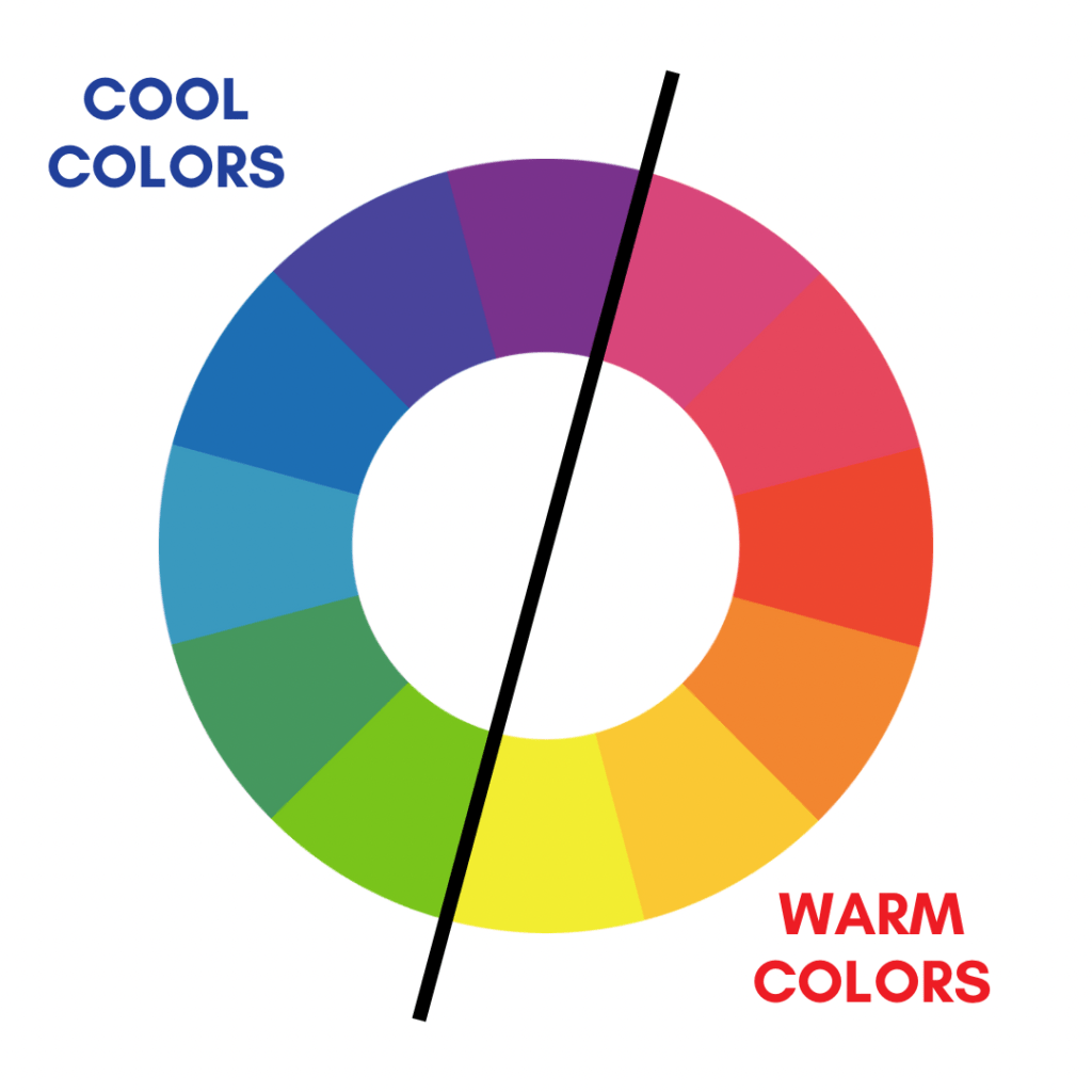
The significance of color temperature lies in its ability to create different moods, evoke emotions, and establish visual hierarchy in a design. Here are some key points to understand its significance:
• Warm Colors
Warm Colors, such as red, orange, and yellow, are associated with energy, vitality, and warmth. They advance visually and create a sense of excitement, passion, and intensity. Warm colors often draw attention, create focal points, and evoke a lively and energetic atmosphere.
• Cool Colors
Cool colors like blue, green, and purple, associates with calmness, tranquility, and serenity. They recede visually and create a sense of relaxation, peace, and stability. Cool colors are often used to create a soothing ambiance, convey a sense of professionalism, or establish a sense of depth and distance.
• Contrast and Balance
Color temperature also significantly creates contrast and balance in a design. Combining warm and cool colors in a composition can create a visually striking contrast that draws attention and creates visual interest. Balancing warm and cool colors can help establish a harmonious and well-rounded color palette.
• Symbolism and Cultural Associations
Color temperature can be culturally influenced and associated with specific meanings and symbolism. For example, warm colors are often associated with energy, passion, and fire, while cool colors can be related to water, tranquility, and calmness. Understanding the cultural connotations of warm and cool colors can help designers effectively communicate messages and evoke specific emotions.
• Temperature Perception
It’s important to note that color temperature is subjective and can be influenced by individual perception. Factors such as lighting conditions, personal experiences, and cultural backgrounds can affect how colors are perceived regarding warmth or coolness. Whether using warm colors to create a vibrant and energetic design or incorporating cool colors for a calming and soothing effect, understanding color temperature can significantly enhance the effectiveness and impact of color choices in design.
By considering these different color combinations and relationships represented on the color wheel, designers and artists can make informed decisions and create visually appealing and harmonious compositions. The color wheel is a visual guide to explore various color possibilities and find combinations that work well together.
As we wrap up this ” Color Theory ” blog post, it becomes evident that this timeless concept is an essential foundation for anyone seeking to delve into the world of colors. By understanding the relationships and symbolism of each hue, we can compose captivating visuals that engage and communicate with their viewers. The color wheel serves as a guide, unlocking the true magic of colors and allowing us to create harmonious palettes, establish mood and atmosphere, and evoke emotions. So, embrace the color wheel and let your creativity soar as you explore the endless possibilities of color.
Also, I would appreciate it if you could comment on my blog post and share it with your friends and followers. Your feedback and engagement are precious to me, and they help to create a sense of community around the content.