When it comes to branding, colors play a crucial role in conveying the essence, personality, and values of your business. The right color palette can evoke emotions, create memorable experiences, and establish a solid visual identity that resonates with your target audience. However, selecting the perfect color scheme for your brand can be a daunting task, as it requires careful consideration of various factors.
In this blog post, we will guide you through choosing the right color palette for your brand. Whether starting a new business or looking to revamp your existing brand, this step-by-step guide will provide valuable insights and practical tips to create a visually appealing and cohesive color scheme that aligns with your brand’s message.
By the end of this blog post, you will have the knowledge and tools necessary to confidently choose the right color palette for your brand, ensuring that your visual identity effectively communicates your brand’s values, captivates your audience, and leaves a lasting impression. So, let’s dive into the world of color and embark on this exciting journey of creating an impactful visual statement for your brand.
Firstly, we will explore the psychology behind colors, delving into the emotions and associations they evoke. Understanding the impact of different colors on human perception will enable you to make informed decisions that resonate with your target audience and communicate the desired brand image.
Consider Color Psychology
Research Color Psychology to understand the meanings associated with different colors. Choose colors that align with your brand’s desired emotional response.
Consideration of color psychology when choosing a color palette for your brand is essential for several reasons:
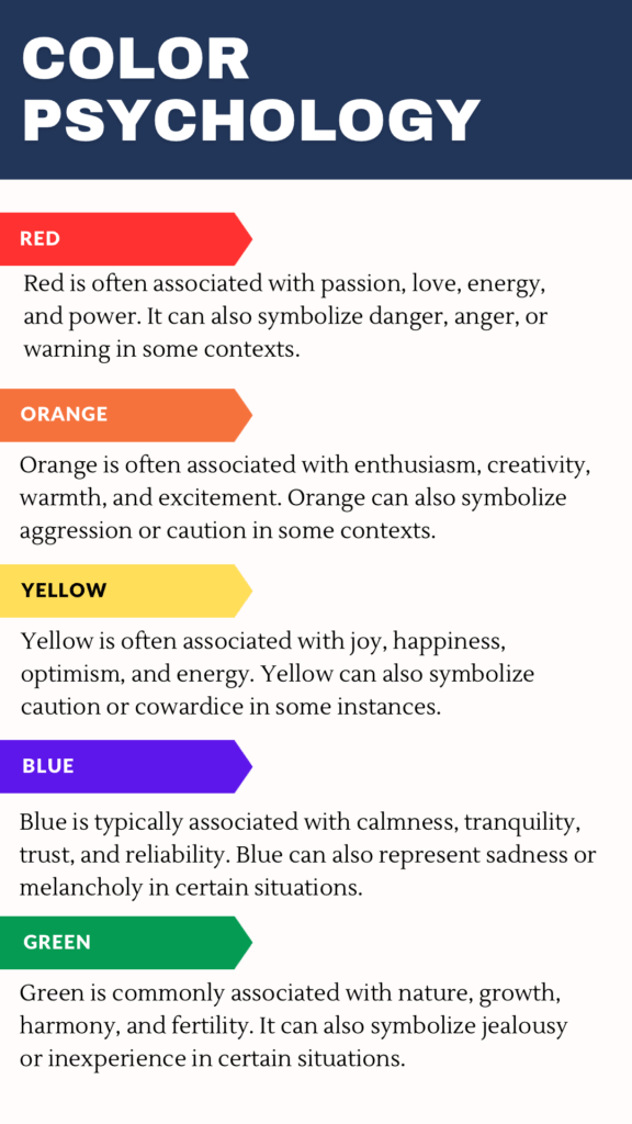
• Emotional impact
Colors have the power to evoke specific emotions and associations in people. By understanding color psychology, you can select colors that align with the emotions and messages you want to convey through your brand. For example, blue is often associated with trust and reliability, while red can evoke a sense of urgency or excitement. Choosing the right colors can help you create a desired emotional impact on your audience.
• Brand personality and values
Colors can also communicate the personality and values of your brand. Each color carries its connotations and symbolism. For instance, green is commonly associated with nature, growth, and sustainability, making it suitable for brands that prioritize environmental consciousness. By aligning your brand’s color palette with its personality and values, you can establish a cohesive visual identity that resonates with your target audience.
• Differentiation from competitors
In a crowded marketplace, standing out from competitors is crucial. The right color palette can help you differentiate your brand and make it memorable. By understanding the predominant colors your competitors use and choosing distinct hues, you can create a visual identity that sets your brand apart. Color psychology can guide you in selecting unique and impactful colors that capture attention and leave a lasting impression.
• Cultural and regional considerations
Colors can have different cultural and regional meanings. For example, while white is associated with purity and weddings in Western cultures, it symbolizes mourning in some Asian cultures. Understanding these cultural nuances is vital, especially if you have an international or diverse target audience. By considering color psychology and cultural associations, you can ensure your color palette is sensitive and relevant to your specific audience.
• Accessibility and inclusivity
Accessibility should be a priority when choosing your brand’s color palette. Ensuring sufficient contrast between text and background colors is crucial for visually impaired individuals. By considering color psychology and accessibility guidelines, you can create a color palette that not only communicates effectively but is also inclusive and accessible to all users.
Now that you know about the psychology behind colors, we will discuss the importance of considering your brand’s personality, values, and target market. By aligning your color choices with these critical aspects, you can establish a solid visual identity that attracts and connects with your intended audience.
Understand your brand
Start by understanding your brand’s personality, values, and target audience. Consider the emotions, traits, and characteristics you want to associate with your brand. This will guide you in selecting colors that align with your brand identity.
Color brainstorming is a creative exercise that helps you generate ideas and explore different color options for your brand. Here are some tips to help you brainstorm brand color session:

• Free association
Start by writing down words or phrases that come to mind when you think about your brand. These could be related to your brand’s personality, values, industry, or target audience. Then, brainstorm colors that you associate with those words. For example, if one of your brand values is “energy,” you might think of vibrant colors like orange or red.
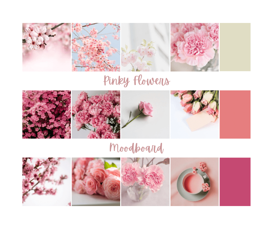
• Mood boards
Create a mood board by gathering images, textures, and colors that inspire you or reflect the desired mood and aesthetic of your brand. Look for inspiration in nature, art, fashion, or even architecture. Pay attention to the colors that stand out to you and consider how they could be incorporated into your brand.
• Color combinations
Experiment with different color combinations to see how they work together. Consider complementary colors (opposite on the color wheel), analogous colors (adjacent on the color wheel), or monochromatic schemes (variations of one color). Play around with different hues, shades, and tints to find balance.
• Visualize your brand
Imagine your brand in different settings or applications, such as a logo, website, packaging, or advertisements. How do you want your brand to stand out visually? Brainstorm colors that create a strong visual impact and grab attention in those contexts.

• Consider practicality
Remember the practical aspects of color, such as legibility and accessibility. Ensure your brand colors work well together, provide enough contrast, and can be easily reproduced across different mediums and materials.
Remember, the goal of color brainstorming is to explore a wide range of possibilities and find colors that authentically represent your brand and resonate with your target audience.
• Research your industry
Researching your industry competitors’ brand colors allows you to make strategic decisions when creating your brand identity. It helps you differentiate your brand, position yourself in the market, align with or deviate from industry norms, and appeal to your target audience effectively.
Look at the color palettes used by successful brands. While you don’t want to copy them, understanding the common color choices can help you differentiate yourself or adhere to industry expectations.
Researching your industry competitors’ brand colors is vital for several reasons:
• Differentiation from competitors
In a crowded marketplace, standing out from competitors is crucial. This knowledge allows you to differentiate your brand by selecting colors that stand out and are distinct from your competitors. Having unique brand colors can help you create a memorable and recognizable brand identity. Color psychology can guide you in selecting unique and impactful colors that capture attention and leave a lasting impression.
• Brand perception
Colors have a significant impact on how people perceive and interpret brands. Researching your competitors’ brand colors helps you understand the associations and emotions that specific colors evoke in your target audience. This knowledge can inform your color selection process, allowing you to choose colors that align with your brand personality and desired brand perception.
• Market positioning
Analyzing your competitors’ brand colors can provide insights into their positioning in the market. For example, if most competitors in your industry use similar colors, it might indicate a common approach or positioning. By researching and understanding these color trends, you can strategically position your brand by either aligning with the industry norms or intentionally deviating from them.
• Visual consistency
Researching your competitors’ brand colors helps you ensure visual consistency within your industry. While it is crucial to differentiate your brand, having some optical coherence with other industry players can help establish credibility and trust among your target audience. Consistency in color usage can also create a sense of familiarity and recognition among consumers.

• Target audience preferences
Researching your industry competitors’ brand colors can provide insights into the preferences of your target audience. If your competitors consistently use specific colors, it could indicate that those colors resonate well with your target audience. By understanding these preferences, you can make informed decisions about your brand colors and increase the likelihood of attracting and engaging your target audience.
•Limit your palette
It’s generally recommended to keep your color palette simple and cohesive. A limited color palette enhances the overall visual impact of your brand design through visual harmony, increased attention, visual hierarchy, consistency and recognition, simplicity and sophistication, and adaptability. By carefully selecting and limiting your colors, you can create a visually striking and cohesive brand design that effectively communicates your brand’s message and values. Select a primary color or two that will represent your brand prominently. Then, choose a few complementary or secondary colors to support and enhance your primary colors.
Visual harmony
A limited color palette ensures that the colors you choose work harmoniously together. When colors are carefully selected and limited in number, they can create a cohesive and visually pleasing composition. This harmony enhances the overall visual appeal of your brand design and makes a sense of professionalism and sophistication.
Increase attention
When you limit your color palette, each color becomes more impactful and stands out more prominently. By using a small number of colors strategically, you can draw attention to specific elements or areas of your brand design. This focused attention helps to communicate your brand message effectively and ensures that important information or visuals are not overlooked.
Visual hierarchy
A limited color palette allows you to establish a clear visual hierarchy in your brand design. By assigning different colors to different elements, you can guide the viewer’s eye to specific areas or messages. This hierarchy helps to prioritize information and create a more organized and easily digestible visual experience.
Consistency and recognition
Using a limited color palette consistently across your brand design helps to establish strong visual recognition. When your audience always sees the same colors associated with your brand, they develop a stronger connection and familiarity with your brand identity. This recognition enhances the overall visual impact of your brand and makes it more memorable.
Simplicity and sophistication
A limited color palette lends an air of simplicity and sophistication to your brand design. By avoiding excessive colors and visual clutter, your design appears more refined and elegant. This simplicity allows your brand message to shine without distractions, creating a clean and impactful visual impression.
Adaptability across mediums
A limited color palette is more straightforward to adapt across different mediums and platforms. Whether it is print materials, digital platforms, or merchandise, using a limited set of colors ensures consistency and adaptability. This adaptability helps to maintain a cohesive brand presence and enhances the overall visual impact across various channels.
• Test the colors
Testing colors for your brand design is crucial for aligning your brand, evoking the desired emotions, differentiating from competitors, considering cultural implications, ensuring accessibility, assessing visual impact and legibility, and maintaining consistency.
Create mock-ups or sample designs using your chosen color palette to see how they work together. Check if they convey the desired emotions and if they are visually appealing. Test how your colors appear on different devices and backgrounds to ensure accessibility and usability.

Brand alignment
Colors play a significant role in conveying the personality, values, and emotions associated with your brand. Testing colors allows you to ensure that the chosen colors align with your brand identity and effectively communicate your desired message. It helps you avoid color choices that may contradict or misrepresent your brand.
Accessibility and inclusivity
Testing colors is essential for ensuring accessibility and inclusivity in your brand design. Different individuals, particularly those with visual impairments or color vision deficiencies, may perceive colors differently. Testing colors helps you ensure that your brand design remains accessible to all users, regardless of their visual abilities.
Visual impact and legibility
Testing colors helps you assess the visual impact and legibility of your brand design across various mediums and platforms. Color combinations may appear differently on screens, print materials, or backgrounds. By testing colors in other contexts, you can ensure your brand design maintains its visual appeal and readability across different channels.
Consistency and scalability
Testing colors allows you to establish a consistent color palette that can be easily scaled and applied to different brand touchpoints. It helps you ensure that your colors remain consistent across various marketing materials, digital platforms, packaging, and merchandise. Consistency in color usage enhances brand recognition and strengthens your brand identity.
• Consider cultural associations
Considering cultural associations when choosing your brand colors is essential for avoiding misinterpretations, resonating with your target audience, expanding globally, shaping brand perception, avoiding legal and ethical issues, and gaining a competitive advantage. By considering cultural associations, you can create a brand identity that is culturally sensitive, relatable, and impactful. Different colors can have different cultural meanings and associations. If you have an international audience or plan to expand globally, make sure your color choices are culturally appropriate and do not unintentionally offend or alienate specific regions.
Importance of considering cultural associations when choosing your brand colors
Avoid misinterpretations
Colors can have different meanings and cultural associations in various societies and communities. For example, while white symbolizes purity and innocence in many Western cultures, it represents mourning and death in certain Asian cultures. By considering cultural associations, you can avoid inadvertently using colors that may be offensive or misunderstood in specific cultural contexts.
• Global expansion and localization
If your brand has a global presence or plans to expand internationally, considering cultural associations becomes even more crucial. Adapting your brand colors to align with the local cultural context can help your brand establish a more substantial presence and connect with customers in different regions. It demonstrates respect for local traditions and customs, enhancing the chances of successful market penetration.
• Brand perception and credibility
Colors have the power to shape perceptions and influence brand credibility. When your brand colors align with cultural associations, it creates a sense of familiarity, trust, and authenticity among consumers. By considering cultural associations, you can ensure that your brand colors enhance the desired perception and credibility among your target audience.
Avoids legal and ethical issues
In some cases, certain colors or color combinations may be associated with specific cultural or religious symbols. It is crucial to consider these associations to avoid any legal or ethical issues arising from misusing or appropriating cultural symbols through your brand colors. Respecting cultural associations helps you maintain a positive brand image and avoid potential controversies.
Market competitiveness
Cultural associations can give your brand a competitive edge in specific markets or segments. By understanding the cultural preferences and color symbolism, you can choose colors that align with the local market’s aesthetics and resonate with the target audience. This strategic approach can help your brand differentiate itself from competitors and establish a stronger foothold in specific markets.
• Get feedback
Share your color palette with colleagues, friends, or your target audience to gather feedback. Ask for their impressions, emotions, and associations with the colors. This feedback can help you refine your choices or provide additional insights.
Remember, choosing a color palette for your brand is subjective, and there is no one-size-fits-all approach. It’s essential to select colors that authentically represent your brand and resonate with your target audience.
How to use brand colors in your designs to connect with your audience
Using brand colors effectively in your designs can help establish a strong connection with your audience. Here are some tips on how to incorporate brand colors to connect with your audience:
• Consistency is key
Maintain consistency by using your brand colors across all design elements, including your logo, website, social media graphics, packaging, and marketing materials. This consistency builds recognition and reinforces your brand identity.
• Start with the primary brand colors
Identify your primary brand colors, typically 2-4 key colors representing your brand. These colors should be used in prominent areas of your designs, such as backgrounds, headers, or critical elements. Consistently using these colors will create a visual identity that your audience can associate with your brand.
• Create color hierarchy
Use your brand colors strategically to guide the viewer’s attention and create a visual hierarchy within your designs. Consider using your primary brand color for essential elements, such as headlines or call-to-action buttons, to draw attention and make an impact. Secondary brand colors can be used for supporting features or to add visual interest.
• Use color contrast
Utilize color contrast effectively to make your designs visually appealing and legible. Ensure enough contrast between your brand colors and any text or essential elements to enhance readability. Contrast can also help create visual interest and guide the viewer’s attention.
Remember, the effective use of brand colors is not just about aesthetics but about creating a meaningful connection with your audience. Consistency, strategic placement, and understanding the psychology behind colors will help you establish a solid visual identity and connect with your audience on a deeper level.
Thank you for taking the time to read my post! I would love to hear your thoughts and opinions on this topic. Did the post resonate with you? Do you have any personal experiences or additional insights to share? Feel free to comment below, and let’s start a conversation!
I’m also curious to know if there are any specific aspects of this topic you would like me to explore further in future posts. Your suggestions and feedback are greatly appreciated as they help me improve and deliver valuable content that meets your interests.
Once again, thank you for your support and being a part of this community. I’m excited to hear from you and engage in a meaningful discussion.